Brand Guidelines
This guide defines the visual language, design style, and principles that shape a clear and consistent brand experience, no matter the team or area of expertise.
At its core, Tonic.ai is about precision and accessibility—just like our mission to synthesize useful data and accelerate local development. This guide lays out the essential design standards that bring our brand to life, from our color system and typography to accessibility benchmarks and documentation.
Whether you design for digital platforms or printed materials, these guidelines ensure every touchpoint reflects the innovation and empathy at the heart of Tonic.ai.
Contents
01 Brand Strategy
02 Personality
03 Logo
04 Color
05 Typography
06 Art Direction
01 Brand Strategy
In the world of software development, bottlenecks happen—privacy risks, broken staging environments, and access issues that silently erode velocity. Teams lose time not because they aren’t shipping, but because they lack useful data.
Tonic.ai restores confidence in your development environments.

Born from the need for safe data access, Tonic.ai was founded on a simple yet powerful mission: to protect data privacy while accelerating development. We believe that efficiency is the underlying enabler of effective work, and that developers shouldn’t be held back by compliance bottlenecks or bad data. With the Tonic platform, we synthesize useful data, eliminate waiting times, and restore confidence in the environments that drive innovation.
At Tonic.ai, we don’t just mask data—we empower teams to build with speed and security. Because when the data is useful, the future looks even brighter.
02 Personality
Tonic.ai’s voice brings our brand to life through the words we write and speak. The way we communicate with you has the power to transform your development cycles and data privacy workflows.
Through clear and intentional language, we make data synthesis simple, accessible, and frictionless. Our direct, approachable, and transparent voice ensures that solving complex data problems feels effortless, so you can move forward with confidence.
Tone & Voice
Our Vision: why we exist
To unblock innovation with usable data.
Our Mission: what we do
To free developers to build with high-fidelity synthetic data, while safeguarding data privacy.
Our Promise: how we help
To provide comprehensive, enterprise-grade, AI-native solutions for generating realistic synthetic data to fuel software and AI innovation.
03 Logo
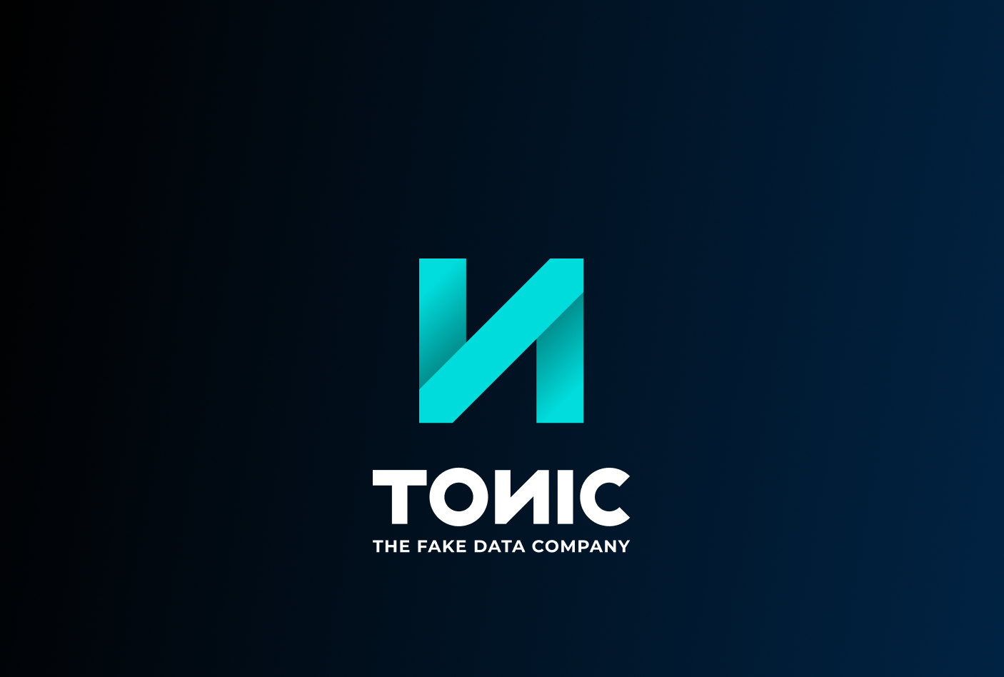
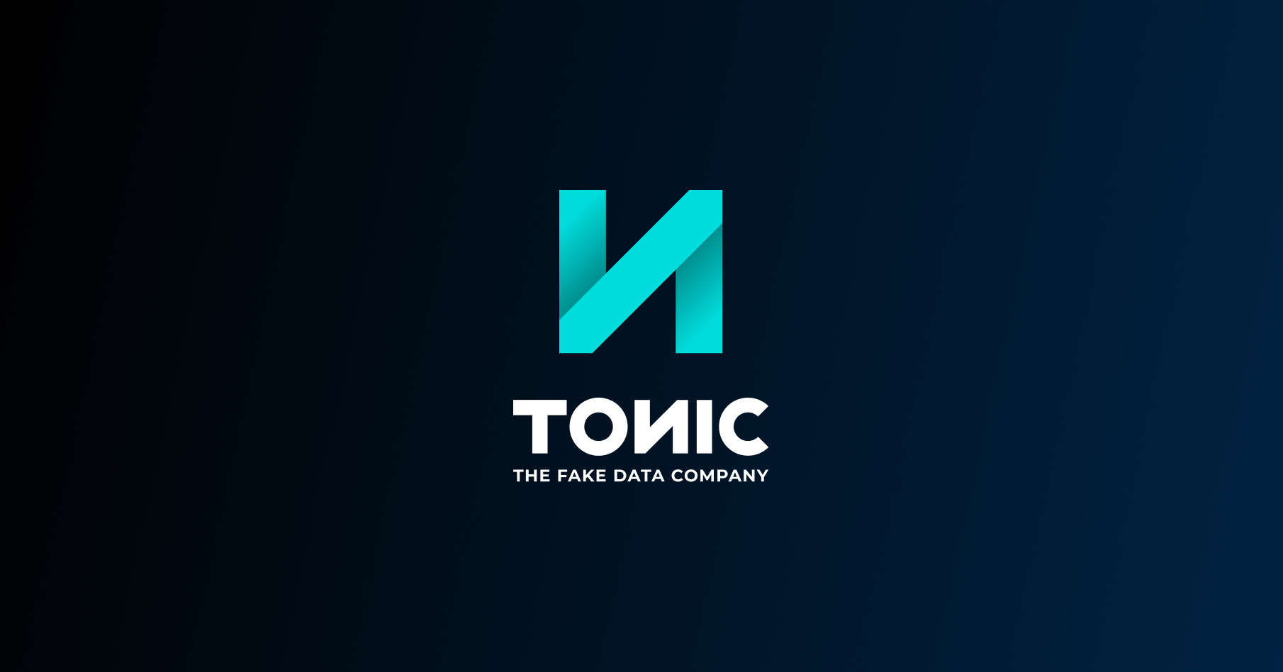
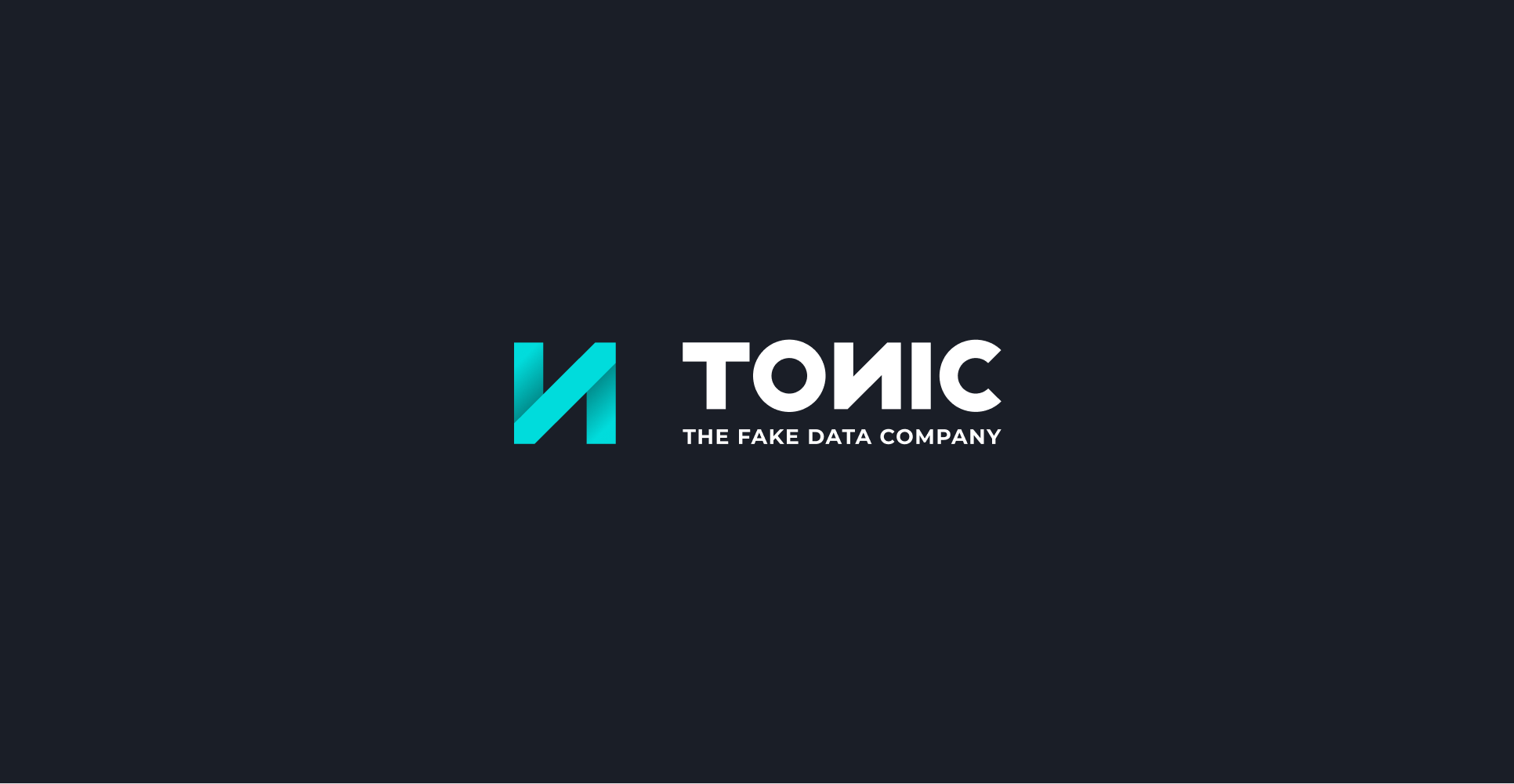
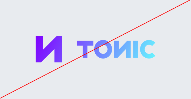
The Tonic.ai logo features an abstract, geometric shape that reflects our position as early pioneers in data synthesis. The clean, intersecting lines create a sense of structure and innovation, symbolizing how we transform complex data privacy challenges into accessible solutions.
Designed with a contemporary aesthetic, the logo's sharp angles and bold profile convey the expertise and reputation of a leader in the field. The vibrant teal gradient suggests the fluidity and transparency of our platform, mirroring our belief that data access is a fundamental research and development need.
More than just a symbol, the Tonic.ai logo embodies our commitment to providing you with useful data that enables effective work. It represents a bridge between privacy and utility—because in modern software development, having the right data is the underlying enabler of your success.
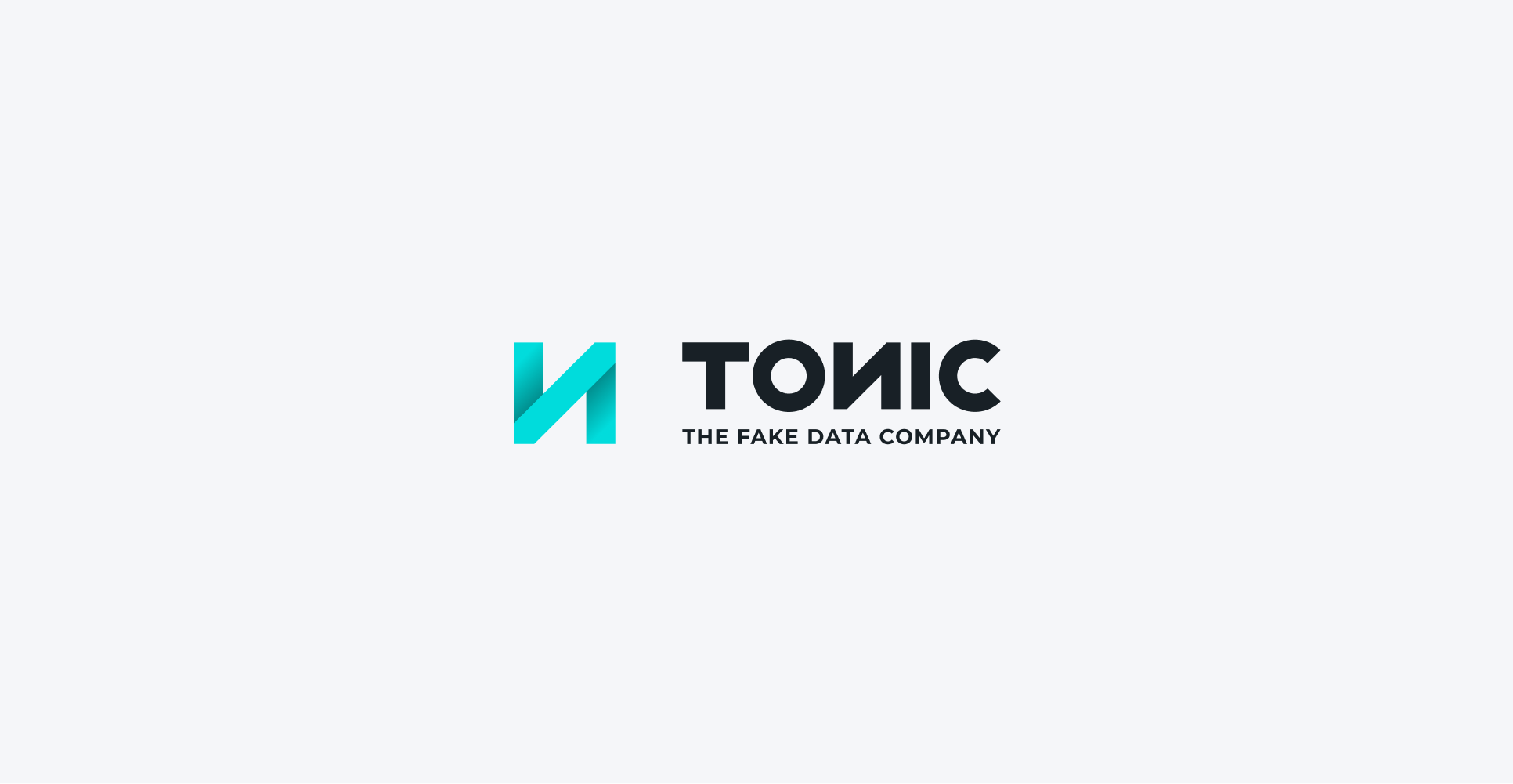
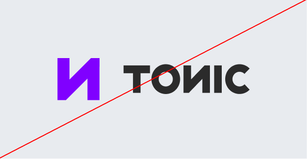
Primary Lockup
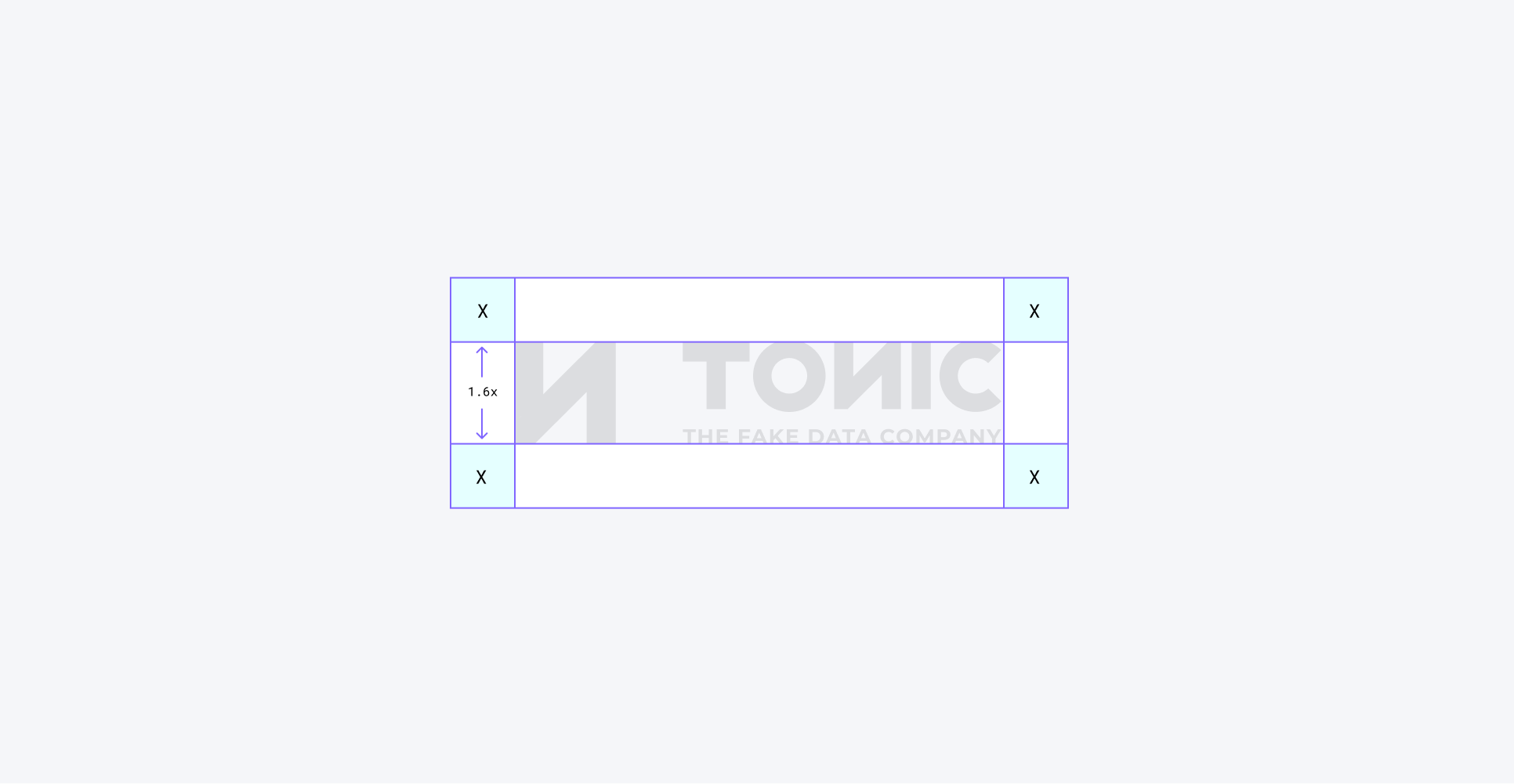
Clearspace
Secondary Lockups
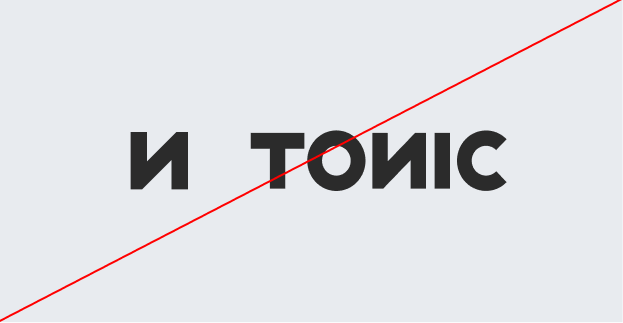
Incorrect Usage

Do not resize the mark
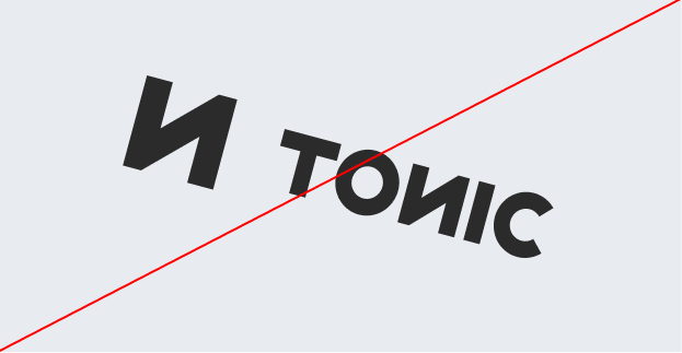
Do not rotate the logo
Do not change the color of the mark alone
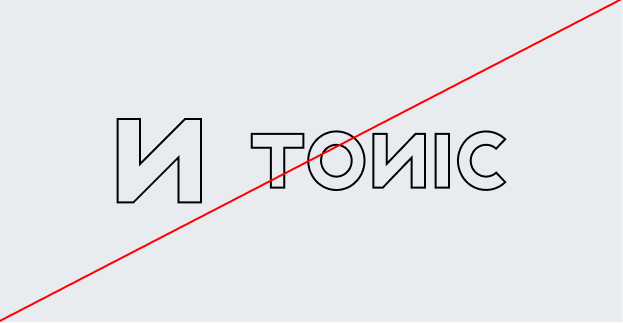
Do not outline the logo
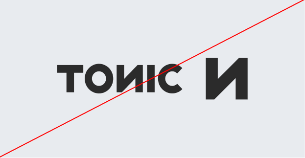
Do not reverse the lockup
Do not add gradients the logo
04 Color
Tonic.ai’s color palette is designed to reflect our identity as innovative and bold pioneers in data synthesis. The vibrant teals and purples evoke the technical expertise and contemporary energy we bring to solving complex data privacy challenges.
Together, these colors create a knowledgeable and confident brand identity, ensuring that Tonic.ai is instantly recognized as the reputable leader in providing the useful data you need to drive effective research and development.
Primary Palette
Teal
Hex: #00DCDC
Purple
Hex: #8000FF
White
Hex: #FFFFFF
Teal 400
Hex: #33FFFF
Secondary Palette
Dark Accent
Hex: #002343
Dark Teal
Hex: #008F8F
Teal 50
Hex: #E5FFFF
Shadow
Hex: #EDEDED
Deep Orange
Hex: #E64D00
Copy Black
Hex: #1A1E27
Subdued
Hex: #67686B
Grey
Hex: #F9F9F9
Gradient Palette
Gradient 1
Gradient 2
Gradient 3
Gradient 4
05 Typography
Tonic.ai’s typography balances clarity and professionalism with a modern type pairing, reinforcing our commitment to technical accuracy and transparency. We use this pairing to ensure our communication remains accessible while reflecting our status as reputable leaders in data synthesis.
Primary Sans-Serif (Inter) is a highly versatile typeface family designed to maximize readability on computer screens. It features a tall x-height and contextual alternates—such as a slashed zero—to help you distinguish similar-looking characters in complex user interfaces. This geometric structure reflects the efficiency and innovation inherent in the Tonic platform.
Secondary (Roboto Mono) is an open-source, monospaced typeface designed specifically for readability across programming environments. As software engineers ourselves, we value how it adapts an approachable character to a fixed-width format, ensuring your code aligns perfectly. This choice underscores our identity as experts who understand your technical pain because we have lived it.
This combination of Inter and Roboto Mono creates a dynamic contrast—innovative yet reputable, and analytical yet approachable. It ensures that all Tonic.ai brand communication is always clear, professional, and empathetic.
Primary Typeface
Inter
Secondary Typeface
Roboto Mono
Sizing
Tonic.ai uses hierarchy to ensure accessibility. We believe readable information enables effective work. Our type sizing is optimized for technical deep dives to make complex problems accessible.
Data privacy challenges shouldn’t slow you down or cause unnecessary compliance stress. Whether it’s a production data leak, a compliance risk, or an inaccessible silo, we step in to provide the useful data you need. Our process is efficient, transparent, and designed to get high-fidelity synthetic data into your hands—quickly and without hassle.
Type Sizes 0–24pt/px
120% Leading
-2% Tracking
Our team works diligently to protect data privacy, synthesize useful data, and keep your development workflows efficient—so you can feel confident about every byte in your environment.
Type Sizes 16-24pt/px
120% Leading
0% Tracking
Whether it’s a data leak, a compliance risk, or an inaccessible silo, we ensure you don’t compromise privacy for the utility you need.
Type Sizes 24–48pt/px
120% Leading
-2% Tracking
Protect Data Privacy, Gain Useful Insights
Type Sizes > 48pt/px
125% Leading
-2% Tracking
06 Art Direction
Tonic.ai’s photography style reinforces our brand’s core values—innovation, transparency, and technical expertise—by showcasing visuals that reflect detail, accuracy, and control.

Clean & Casual
Photography should feature modern, well-lit workspaces with a clean and contemporary feel. The focus should be on transparency and accessibility, avoiding clutter or overly dramatic compositions.
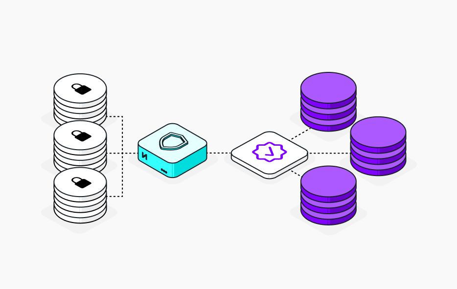
Isometric Diagrams
Tonic.ai’s illustrations use isometric 3D perspectives—bold black outlines, vibrant teals, and geometric shapes like database cylinders—to transform complex infrastructure into transparent visuals that highlight our tech-driven approach to data privacy.
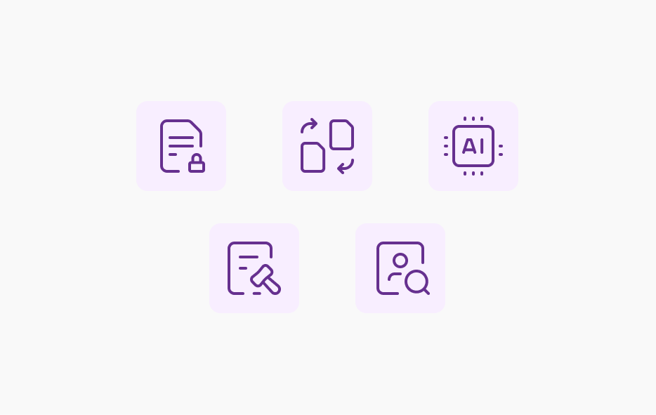
Accessible and expert iconography
Iconography should feature minimalist line-art symbols from the MyIcons library—consistent stroke weights, rounded terminals, and monochromatic purple hues—to represent complex technical concepts like data synthesis. This reinforces Tonic.ai’s role in transforming intricate data challenges into accessible, expert solutions for software engineers.

Visualizing Data Transformation
Abstract graphics should feature flowing, parallel lines with linear gradients—transitioning between deep purples and vibrant teals—to represent the seamless movement and transformation of data. This reinforces Tonic.ai’s role in providing technical sophistication and clarity, helping you visualize how our innovative platform turns complex data challenges into accessible solutions.